The Forms and Conventions of the front page of a Music Magazine
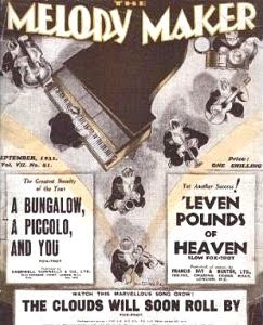
There are several eminent music magazines in heavy rotation throughout the United Kingdom, with those which are most prominent reaching circulation heights of approximately thirty to fifty thousand copies per issue. Despite the existence of an endless stream of musical genres and sub-genres, and several music magazines devoted to them, the codes and conventions of music magazines do not vary greatly, and generally persist with a similar generic formula for each publication.
Some of these codes and conventions include:
Some of these codes and conventions include:
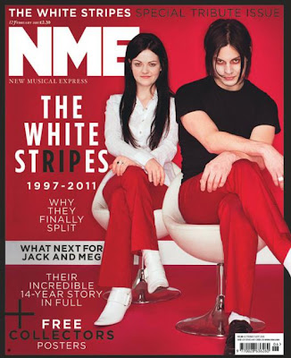
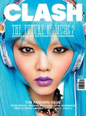
- The masthead of a magazine (title) in a clear, bold font at the top of the page, some well known publications such as 'Q' magazine may choose to show simply a logo as the masthead, as upon viewing this logo one is immediately aware of the publication to which it belongs due to the established nature of the magazine.

- A main image, generally of an artist or band, with some exceptions for instrument based magazines such as 'Guitar'. The artist is customarily well-established with a firmly rooted fan base in order to generate higher rotation for the publication. However, magazines which actively seek innovation within the music industry such as 'NME' often select up and coming artists, due to the fact that this is what the target audience of the product seeks.
- A price/barcode or, if the magazine is a free one such as 'The Fly', a clear badge/text stating that this is the case.

- Month/issue number.
- Sub titles: bands/artists featured within, in order to draw one's attention to the product.
- A description of the magazine itself, ie: "New Musical Express" (NME), "Britain's Biggest Music Magazine" (Q).
- Lists of bands/artists featured.
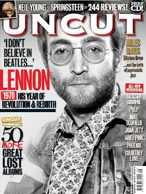
- Badges "Free CD!" in order to catch the attention of the reader.
- Thumbnail images to give the potential reader an idea of what is featured within the magazine.
The Codes and Conventions of a Contents Page
Delving beyond the front cover, Music Magazines habitually feature certain conventions. Some of these conventions include:
- Contents Page
 The contents page often includes several images of Bands/Artists, the most prominent image being that of the Artist featured on the front cover, as is visible with the example above (a recent issue of Clash Magazine). The contents also commonly includes a concise list of the Bands and Artists which appear within. In this case, the lists are separated into a 'Features' section and a 'Regulars' section.

However, many Music Magazines may choose to take a contemporary, simplistic approach to creating a contents page, which is illustrated in this example (The Fly Magazine, January 2011). Through the utilisation of only one image and a colour palette of just orange, black and white, one is immediately drawn to the image and the page takes on a minimalist, stylish feel whilst remaining informational and practical.
Upon creating a contents page, I will take each of these examples, amongst others, into consideration and endeavour to design an original, modernistic contents page which adheres to the style of magazine which I aim to create.
Analysis of NME Magazine

NME (New Musical Express) is a highly popular weekly music magazine published in the United Kingdom by IPC Media, one of the leading magazine publishers in Great Britain. IPC Media is a subsidiary of Time Inc. whose parent company is leading media conglomerate Time Warner. The magazine itself focuses on the genre of rock and its various sub-genres, whilst seeking to introduce innovative, up and coming bands and artists to its readers.
NME was originally published as a music Newspaper in 1952, taking on the form of a magazine in the 1980s, and has enjoyed enduring success since.
In contrast to many other well-established music magazines, NME often features ground-breaking new artists rather than those with an already well established fan base, as the audience predominantly seeks a world of music which is continuously revolutionised by a constant stream of new artists. This is exemplified below, as NME recently featured psych-rock band Warpaint on the cover of the publication just one week after the release of their debut album 'The Fool'.

Although those who purchase the publication may vary in terms of age, gender, class and status, etc; the perceived target audience for NME is likely to be predominantly male and between the ages of 16-25. This is reflected within the male targeted advertising of products such as Lynx, Wilkinson Sword (below) and sports companies such as Adidas, aswell as the habitual musical advertisements.


Like the music featured, NME also regularly breaks the convention of several columns with images secondary to the text, and images often bleed out rather than concisely fit into frames. This correlates with the youthful, exuberant nature of the magazine and captures the young audiences' attention.
 Until Krissi Murison, previously music editor at NYLON magazine in New York, was appointed as editor of the publication in mid 2009, the colour of the famous 'NME' logo was unchangingly red, the colour scheme often revolving around this. Upon her arrival as editor, Murison led the magazine to adopt a modernised aesthetic, opting for a more simplistic layout and a logo which changed colour from week to week - often bright and striking in order to attract potential readers.
 The contents page of the magazine also follows a simple, clean style, featuring images of only the most important features within.


