Wednesday, May 11, 2011

Audience Feedback

Audience feedback is highly significant when creating a media product, this is as it enables the individual who has created the product to gain an objective, outside view of what could possibly improved or altered. It also offers a range of differing views and opinions meaning that it is easier as a collective to come to a conclusion as to how something could be improved.

During audience feedback the entire class sat down together to view and discuss everybody's media products. Aswell as this, we each discussed our construction processes and what we found particularly difficult or enjoyable about it, enabling me to see that everybody was in the same boat in terms of this being a significant learning curve.

In terms of my own media product, the class was particularly positive which made me feel much more confident about the quality of my magazine.
The feedback consisted of:

Positives:
  • High quality, striking cover image
  • Simplistic features make for a unique style
  • 'Clean' feel of magazine is attractive
  • Range of colours used well
  • Contents page is of particularly high quality and draws the reader in
  • Title font of double page spread works well
  • Images are well edited
  • Good quality of prose
  • Realistic - complies to codes and conventions well
Negatives:
  • Some of the font on the cover page is difficult to read
  • The text is quite small in places
As a result, I made larger spaces between the letters of the text on the homepage, thus making the text easier to read. I also ensured that all text on every page was readable.


Wednesday, May 4, 2011

NOTE TO EXAMINER

See research and planning sections in February and March archives of blog.

Tuesday, April 26, 2011

7-Looking back at your preliminary task, what do you feel you have learnt in the progression from it to the full product?

From the initial stages of the preliminary task to the final stages of the main task, I feel as though I have been constantly learning new skills. These skills are not only technological, such as those previously mentioned in question six, but also general skills such as time management and planning.

With the initialisation of the preliminary task, the prospect of eventually developing my design skills to the extent that I may be able to create a high quality media product seemed extremely daunting, especially considering the fact that I did not possess any prior experience with the software, or designing in general. However, the construction of the preliminary task significantly aided my developmental skills and comprehension of what the task entails.

With the preliminary task, the construction of a school magazine, I intended to create something not entirely dissimilar to the basic structure of what I had in mind for the main task. This was in order to enable me to take what I had learned from the construction of the preliminary task and apply it to the main task. I was then able to gain a wider perspective on the creation process as a whole, and could consider exactly what I wished to achieve with the main task. The preliminary task also allowed me to learn to experiment with technology and to not be afraid to make mistakes in order to gain the skills necessary to create a successful final piece.

Throughout the construction process, it has been highly important to me to manage time in a manner which would allow me to meet all deadlines with the peace of mind that all needs of the task have been met (ie. meeting all conditions of the task, including the necessary forms and conventions of a music magazine, etc). These skills are particularly beneficial, as I feel that they are necessary not only in terms of education but throughout life and in all professions.

Overall, I feel as though this task has allowed me to gain a vast amount of confidence when using editing equipment such as Photoshop and InDesign. As well as this, the task has encouraged me to not be afraid when approaching unfamiliar tasks, and to do so with self-reliance.

6-What have you learnt about technologies from the process of constructing this product?

The creation of the product has allowed me to significantly develop my media skills, not only in terms of design but also in terms of image manipulation.

Any images utilised within the magazine were taken with a Nikon
SLR camera; I was particularly grateful for the professional quality of images that such acamera could offer, and learnt how to enhance my photography skills from the task.

Initially, I manipulated images utilising Adobe Photoshop. With no prior experience of this software, it was necessary for me to learn the skills required in order to be able to alter chosen images to a satisfactory standard. After some experimentation, I was able to gain the necessary understanding of Photoshop and manipulate the images. It was also important to consider representations upon editing the images; the images must reflect what I intended to convey with the creation of the product. Thus, any selected images needed to be representative of the individualistic 'indie goth' image of the product.

Photoshop is an indispensable tool when creating a product such as a magazine, allowing images to be transformed from imperfect to stylistically pleasing. This is exemplified in the before and after images below, the latter being utilised within the double page spread of my magazine.


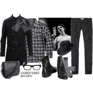
Moreover, all images were manipulated in a different manner in order to achieve a variety of effects. For example, the image featured on the first page of the double page spread was originally a generic black and image; I then learnt how to cut the figure from the background and alter the image to achieve an artistic feel which reflects and enhances the creative nature of the magazine itself (above). The two images featured on the second page of the double page spread were edited with the conscious intention of appeari
ng grungy and naturalistic in order to reflect the realm of indie music and the approachability which contrasts the cover star's beguiling stage persona. A drop shadow effect was thenadded to ensure that the images were striking, despite being less predominant and possessing a far more delicate feel than that of the facing page.

In order to achieve the striking appearance for the contents page, I selected an image taken at a musical event. The main feature of the image was that it correlated with the minimalist yet distinct aesthetic of the magazine. However, the image was in colour. I decided that in order to further the mysterious, powerful representation of the musician, the image should be black and white and the contrast edited in order to gain a darker, mystical feel; as is visible below with the completed page. The simplistic nature of the page allows the image to stand as the main focal point.

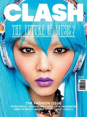
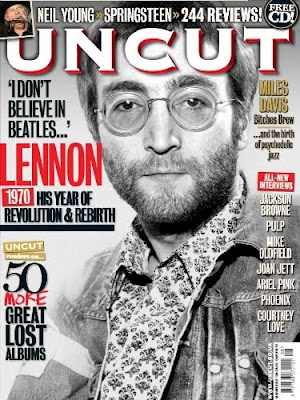
The cover image was manipulated in a manner which would enhance the striking colours and my intention was to achieve an ethereal, otherworldly aesthetic with the image, which is reflective of the artist and her music as well as the direction in which I wanted to steer the magazine.

To create the magazine, Adobe InDesign was utilised. Primarily, I found it somewhat difficult to achieve the feel which I was seeking to attain due to a lack of experience with the software. After some experimentation, however, my skills advanced slightly and this became a less strenuous process; I then began to enjoy experimenting with the programme to create different stylistic features. The minimalist feel of the magazine was achieved by paying strict attention to detail when choosing elements such as fonts, colours and the placing of images and text. Once mastered, the high standard of InDesign aided the process of the construction of the magazine and allowed me to achieve a high quality final product.

5- How did you attract/address your audience?

In order to attract a particular target audience, it was indispensable for me as the creator of the product to gain a wide understanding of what it is exactly that this demographic of individuals seek in a music magazine. In order to gain this knowledge, I approached numerous people who fall within the category of the target audience (see question four) and made notes on key features that these individuals were unanimously seeking.

It appeared to me that what the audience were seeking was a high quality: in terms of writing, information, and musicians, rather than to be bombarded with unnecessary facts. The individuals questioned were also extremely enthusiastic about gaining the opportunity to discover and to learn more about bands and musicians who do not necessarily gain a wide amount of exposure from existing music media products.

With this knowledge at the forefront of my intentions, I set out to create a product which would address these features and appeal to an intellectual audience who value quality over quantity.

In order to attract potential readers, the layout of the front cover needed to be striking, whilst also being definitively separate from every other magazine on current news stands. The distinctive qualities of the minimal design scheme, solid white background, striking colours (emerald green, darkened pink) and bold, brazen fonts when addressing certain features such as the name of the cover star, are all conscious attempts to create a salient front cover which appeals to an audience seeking an alternative from the majority of magazines currently on sale.

The badge, a popular convention of music magazines, aims to attract potential readers as it 'jumps out' of the page, the text, imperative sentence '10 new bands you must hear', implies that the magazine offers necessary information and thus is worth purchasing simply for this.

The list of bands on the left hand side of the page also attracts attention as, upon viewing that a favourite band is featured within, an individual may purchase the magazine.

The striking appearance of the cover star (black make up, green dip-dyed hair, black clothing) also capture the attention of individuals. However, upon viewing the double-page spread, it is immediately apparent that the artist is not wearing the same bold make up, nor does she adopt the same expression of fearlessness. This was a conscious decision to create a character to whom readers can relate; an individual who exhibits paradoxical qualities. On the one hand, a bold, brazen musician, and on the other, an approachable young person who is passionate about her creative interests. The aesthetic of the artist encourages people to not be afraid of exploring different aspects of their persona, and this is reflective of the target audience.

Sunday, April 24, 2011

4- Who would be the audience for your media product?

The exemplary reader of Space magazine is nineteen year old student living close to central London and studying Art/Literature at Goldsmiths University/UCL. The individual listens to alternative music and is constantly seeking to discover new bands/artists, reading music websites such as pitchfork.com on a daily basis and purchasing CDs/Vinyl on amonthly basis at locations such as that featured within the main article of the magazine (Rough Trade), and listens to alternative rock bands such as The Kills and Deerhunter, as well as electronic based music .

The reader attends live music events as well as art galleries, the cinema, etcetera. and works in a record shop during the weekends in order to fund these activities. The reader has a strong interest in fashion but also takes pride in originality, choosing to shop at independent and vintage stores aswell as popular high street locations. Other magazines which the reader may purchase are 'Clash', 'NME' and 'Dazed & Confused'.


The style of language within the magazine reflects the intellectualism of the readers, and I wished to focus on maintaining a high quality of writing throughout, as I feel that it is unnecessary and at times insulting to assume that the standard of writing should be compromised when dealing with a young target audience (16 to 25 years).

Another important element I wished to avoid was that of targeting the publication at one particular gender; Space magazine is aimed to appeal to both males and females in equal measures, and thus products such as razors/sportswear would not be advertised within, and instead only music and fashion-oriented advertisements targeted at both men and women would appear, as well as the habitual live event adverts found within this genre of magazine.

The advertisements within a magazine must reflect its audience to some extent, and so this was something that I considered at length. In a sense, the audience and content of the magazine are interconnected, with each acting as a reflection of the other.

3- What kind of media institution might distribute your media product and why?

Initially, I considered the most appropriate distributors of 'Space' magazine to be an independent company (such as the Dazed Group), simply due to the fact that, with it, I focus solely on independent and alternative music; distancing the musical content far that released by international media conglomerates such as Sony and Warner and opting instead for music released on independent record labels such as Rough Trade and Domino.

However, after greater consideration I decided that if the magazine were to be released by a powerful, expansive distribution company, it would gain the ability to reach a wider audience and thus possibly introduce many people to a new array of musical interests which do not necessarily receive enough interest from the media.

This positive aspect of joining forces with a mainstream distributor greatly outweighed the main reason why I wished to release the magazine with an independent company, which was to maintain a D.I.Y aesthetic throughout. I felt that the magazine did not have to compromise this in any way, simply because the distributor was a major contender in magazine distribution.


Thus, I chose for the magazine to be published by IPC media, due largely to the fact that, as one of the largest magazine publishers in existence, they would be able to offer the necessary resources, particularly in terms of advertising, to allow the magazine to reach a wide number of individuals. Another reason why IPC seemed appealing was the fact that, as the distributor of NME, the company already has a considerable amount of experience with alternative music magazines.

Taking the aforementioned points into consideration, the magazine would be available for purchase in a wide array of locations, including newsagents and stationary specialists such as WH Smith. The magazine would also be available for purchase on the magazine's official website, with readers being given the opportunity to purchase just one magazine rather than being bound to a full twelve month subscription. This means that if an individual is particularly interested in a cover star or feature within an issue of the magazine, they are able to purchase it at ease whilst being offered the freedom to choose particular issues.

Saturday, April 16, 2011

2- How does your media product represent particular social groups?

The predominant social group represented within 'Space' magazine would be young individuals who possess gothic, individualistic characteristics and wish to distinguish themselves from the crowd.

The cover star of 'Space' magazine is a twenty year old inhabitant of London who is passionate about music amongst other things such as art, fashion, film and culture. I purposefully chose a cover star who would act as an accurate reflection of what the readership of the magazine embodies, and an image which readers would aspire to/admire.

The originality which the magazine aims to convey to its readers is reflected by the stylistic elements of the cover star, who is dressed entirely in black clothing, and wears bold make-up and an expression of fearlessness; the mise-en-scene of the main cover image invites connotations of somebody who is not afraid to be an originalist. The cover star is looking straight into the camera without hesitation, the mid-shot allows for visibility of the costume; an important tool when attempting to convey a particular image. The readers of the magazine would have a similar life philosophy to that of the cover star, aswell as the other musicians featured within.

Friday, April 8, 2011

1- In what ways does your media product use, develop or challenge forms and conventions of real media products?

In the main task, the creation of 'Space' magazine, I used, developed and challenged several codes and conventions in relation to existing music magazines. In many respects, the media product adheres to the majority of conventions associated with music magazines, with the cover page featuring a large, bold masthead, price, month & issue number, barcode, badge (in order to entice possible readers) and a list of bands featured within, to name a few.


The title of the magazine is also a conscious attempt to reflect the content; with the homographic word 'space' connoting the spaciousness and purity of the magazine, the spacing of the letters reflecting this, as well as meaning the expanse of the solar system and the vastness of existence. The futuristic connotations of the word also appealed to me greatly.


Similarly, the layout of the contents page featuring the month/year, the magazine title and the word 'contents' (below) all correlate with the conventions of current music magazines. However, the single focal point of the page is a black and white image I captured at a live event. With this I intended to challenge the convention of including a several images on a contents page, and wished to continue the minimal yet striking aesthetic of the magazine. The text on the page tells readers of the main features within, with a short description of each article.


The double page spread also follows many forms and conventions ofmusic magazines, with a large title (to capture the reader's attention), introduction to the article, text organised within columns, images of the artist featured and quotes picked out from the text (see below).

Despite this, with the simplistic, minimal design scheme of the product, I wished to deviate slightly from the likes of Q, Kerrang, etc. in which maximalist design schemes often feature, often including a large array of colour and information. The design of the magazine is a conscious response to the overload of information and we habitually receive from the media; by focusing on a clean, light and spacious layout I endeavoured to present readers with the information desired by readers and nothing more, focusing on the quality of information given rather than quantity.

Friday, March 4, 2011

Synopsis of Media Text

With the creation of the front cover, contents page and double page spread of 'Space' magazine, I aim to design a simplistic, refined music magazine which is valued as a well written and highly respected source for the latest in cutting edge music.

The design shall be modern, reflecting the subject matter, with predominant colours used being black and white and bursts of brighter colours appearing throughout. The name 'Space' reflects the modern content of the magazine and an exploration into the unknown. The magazine will express many elements habitually found within fashion magazines whilst simultaneously focusing the majority of its attention on highly reverenced music journalism.

The two page spread will feature cover story, an article featuring singer-songwriter Fabienne. I chose to move away from the generic interview layout style of question and answer, and instead I am currently in the process of writing the article as a continuous piece of prose.

Thursday, March 3, 2011

Target Audience

The target audience of 'Space' Magazine is individualistic, discerning and passionate, not only about music, but the discovery of ground-breaking artists and bands.

The age range of the audience at which the product is aimed is 16-25, with focus being held upon those of university age (18-22) in particular. I feel that the quality of writing should not be comprimised when aiming to appeal to a younger audience, and hope that the article shall be well written without being ostentatious.

The reader of 'Space' is devoted to style aswell as music, whilst remaining an individual who does not wish to comply with others' simply as it is the fashionable thing to do. The reader is interested in current events and is constantly seeking to enhance their knowledge on many subjects and cultures and appreciates art in various forms.

Those who read 'Space' lead active social lives, but are as happy to read the works of Kant as they are to go to an all night party; they also are open to the discovery of several different genres and sub-genres of music, viewing quality as the most important factor.

'Space' magazine is targeted equally at males and females, following the view that gender is not particularly important when it comes to music and creativity.

Equipment/Location Planning

I plan to travel to London to shoot my images at infamous Brick Lane, complimenting the indie, DIY yet sleek, minimal aesthetic of the magazine which I plan to create. With white washed walls, recording areas and rows upon rows of records, Rough Trade is an ideal location. Rough Trade is also a highly esteemed record label which has been functioning for over 50 years and is the home of some of the most well loved indie music, something which I feel accurately accompanies the aesthetics of the magazine.
In terms of equipment, I plan to take the images on a Nikon SLR Camera, later utilising photoshop to edit the images and InDesign to edit the magazine itself; this shall be done on a Mac PC.

Human Resource Planning

As model and musician, I will appoint Fabienne, who is an inhabitant of London just like the mystical character I plan to create. Fabienne is an ideal model as the image of her seen within my magazine is not a falsified image, but rather a representation of her own personal style, which I hope will bring a sense of genuineness to the media text. With pale skin, long, wavy hair with emerald tips, a slim build and dark, gothic make up, Fabienne is a reflection of the modern, cutting edge musician, and her character is one who is on the path to propell music into the twenty second century.

That the model is young enhances the fact that I wish to aim my magazine at youthful, intelligent individualists, the musician on the cover perhaps being something of a role model for these young people. In some respects, the magazine which I plan to create is a response to the diminishing quality of music magazines aimed at people within my own age demographic (16-25), which may at times undermine the intelligence of young people in order to generate greater sales.

The model's somewhat gothic style represents the darker, mysterious aspect of the musician, an aspect which is at the forefront of both the music and the fashion world, with musicians such as The XX and Lykke Li, and fashion designers such as Yohiji Yamamoto, Alexander Wang and Maison Martin Margiela all adopting mystical, sombre images.

Below: influences Swedish musician Lykke Li and Yohji Yamamoto a/w 2011


Monday, February 28, 2011

Music Magazines - Target Audiences

The target audiences of music magazines vary widely depending on the particular publication. However, it is generally the case that weekly music magazines such as NME and Kerrang aim to appeal to a younger readership of students aged 16-25, whereas many monthly magazines such as Q, Mojo and Uncut are targeted towards an
older audience of individuals aged 30-50. The target demographic for NME is predominantly male, something which becomes immediately apparent when viewing the advertisements featured promoting products habitually targeted at at young males by companies such as Lynx, Wilkinson Sword, Adidas Sportswear, Strongbow, etc. These males are generally aged between 16 and 25, with an averageage of 18; this demographic is signified by the post-modern, humorous tone which many of the articles feature, something which is not as predominant within magazines targeted at a mature audience such as Mojo and Uncut. 94% of NME readers utilise the internet, which explains the substantial success of
accompanying website NME.com.

Music magazines which include elements of fashion, such as Clash, Fused and Dazed & Confused, have a slightly older average readership age of around 24-25, and readers are generally equally passionate about music and fashion.

Readers of music magazines have a great enthusiasm for musical culture, and this is generally their main passion. However, advertising within these publications is highly profitable and generates a large amount of revenue for both advertisers and publishers.

Below are examples of the typical appearance that a music magazine reader would take on.

The History of Music Magazines

The music magazine is amongst the most dynamic and thriving sectors within the publishing industry and, by definition, must modernise and transform with the constant revolution of the musical climate. Thus, the journey from the emergence of the music magazine to its current position has been a thoroughly changeable one.

The very first music magazine to be published is not certain and cannot be ascertained for sure. However, it is believed that such publications existed as early as the eighteenth century. The first prominent music magazine to be published in the United Kingdom was Melody Maker in 1926, focusing primarily on Jazz music coverage, an exceedingly popular genre at the time, the magazine rapidly became Britain's most popular weekly music magazine and remained so for almost half a century. The magazine was targeted at musicians/budding musicians, and is known to be the first weekly music magazine in existence. Melody maker was published by Time Warner subsidiary IPC Media and throughout the years, boasted highly influential music journalists such as Max Jones and John Peel amongst its staff.

1952 saw the emergence of NME (New Musical Express) magazine, also published by IPC Media, a magazine focused strongly on introducing new alternative music to its readers, with an increasingly youthful target audience. Due to Melody Maker being slow to feature coverage of the increasingly prominent rock 'n' roll genre in the 1970s, NME became Britain's most popular weekly music magazine and Melody maker lost some of its previously enjoyed success. As a result of this, the two magazines later became 'rivals'. In 2001, Melody Maker could no longer maintain a healthy readership and merged with New Musical Express.

For a younger audience interested in pop music, magazines such as Top of the Pops (1995-present) and Smash Hits (1978-2006) were available, experiencing considerable success during the 1980s.

Presently, the number of music magazines in existence is the largest that it has been in history, with several music magazines to suit every sub-genre imaginable. Despite numerous set backs with the mounting popularity of the internet in the early nineties, overall it is now apparent that the digital age has not been a hindrance to the music magazine industry, but has helped to bring several music magazines into light. The internet has also aided music magazine publishers as it also allows accessibility with people being able to read articles online and thus decide to purchase the magazine itself. The design of magazines has also been enhanced greatly due to editing technology such as photoshop, as is evident upon viewing a recent cover of Clash magazine (above).

In conclusion, the music magazine industry is one which we will no doubt see continue to thrive throughout the 21st century, with the process of distribution and consumption constantly being aided by the advances in technology being made daily.

Media Institutions - IPC Media

IPC Media is also one of the leading magazine publishers in the United Kingdom, currently owning five separate publishing divisions and selling over 350 million magazines per year. IPC originally came into light in the 1950s and has continued to dominate the magazine industry since.
Amongst several different variations of magazines, IPC publishes two of Britain's most successful music magazines: NME and Uncut.

With the evolution of the internet and constantly improving technology, IPC released music magazines now have the opportunity to thrive technologically aswell as in print, with NME's website rapidly becoming one of the most successful and widely utilised music websites, and a news section being constantly updated. This has proven to be of inestimable value for IPC media as a great amount of interest is generated through this.

As IPC is owned by a media conglomerate, the use of convergence may be a valuable tool for Time Warner, allowing the institution to promote interest in its several products via its music magazine division.


Media Institutions - Bauer Media

In terms of music magazines in the United Kingdom, a major competitor is the Bauer Media Group, a private publishing company based in Hamburg, Germany. The Bauer Publishing group comprises of 282 magazines internationally in 15 countries and counts leading British music magazines Q and Kerrang amongst these publications.

Aswell as magazines, Bauer Media also branches out to own numerous radio stations and television channels, namely Box Music Television in the
UK. The company was founded in 1875 by Heinrich Bauer and currently remains a family-owned company.

Q magazine was first published in 1986, aiming to set a higher standard of modern music writing and photography. In recent years, the Q empire has expanded to include a popular radio station and television channel. With the emergence of the digital age, the magazine's website has expanded and the Q empire continuously creates substantial revenue for Bauer Media.

Kerrang magazine, first published in 1981, is a weekly rock music magazine which focuses on heavy metal music. Other Kerrang products include a radio station, a television channel, the Kerrang awards and a Kerrang tour. Kerrang magazine has a circulation of 134,000 and is one of the largest companies owned by Bauer Media.

Main Task - Backwards Plan

  • Completion of Blog: Monday 27th April
  • Evaluation Completed: Friday 25th April
  • Completion of Main Task: Monday 28th March
  • Layout and Editing Completed: Wednesday 23rd March
  • Pictures Edited: Wednesday 9th March
  • Text Completed: Monday 7th March
  • Planning and Research Completed: Friday 4th March

Wednesday, February 16, 2011

Initial Ideas for Music Magazine

When considering which style of music magazine to create, the overall idea of a simplistic, sleek and streamlined music magazine focused on innovation and originality appealed to me greatly. With this style of magazine I wish to appeal both to a male and female audience in equal measures.

The idea of a guitar-based music magazine originally appealed to me, due largely to the current success of the genre. The magazine would be similar in many ways to NME, but different in design and overall target audience. The magazine would also feature several articles aiming to guide those who play the guitar/wish to work in the music industry, with other features including 'best guitar' articles, etc.

The second idea which occurred to me was to create an innovative, cutting edge music magazine with stylistic elements and a sleek layout. The magazine would feature several different sub-genres of indie music rather than simply guitar music and feature primarily 'up and coming' artists. The magazine would be aimed at individualistic young people between the ages of 16 and 25 who are passionate about the discovery of new music.

After great consideration I chose to create the second proposed idea, as I believe that it is something which does not currently exist within the mainstream magazine industry and therefore would be more of a challenge to produce, in turn allowing me to learn and to enhance my creative thinking and design skills.

Tuesday, February 15, 2011

Analysis of Clash Magazine


Clash is a widely favoured music magazine published monthly in the United Kingdom with a circulation of around 40,000 issues. Featuring many stylistically unique elements and often incorporating fashion elements aswell as musical features into its content, Clash may be described as a 'fashionable music magazine'.


Clash magazine does not adhere to any particular genre of music, and often alternates between featuring rock bands such as The Dead Weather, hip-hop artists such as Jay-Z and Kanye West, pop acts such as Duffy, and electronic acts such as Daft Punk (below). Thus, Clash appeals to an audience with a varied taste in music.
Aesthetically, the magazine's design is simple, modern and features an array of bright colours to capture the potential reader's attention. Several badges, "3 Free Songs!" also intend to gain attention. Inside, the magazine's colour pallete predominantly consists of black and white and illustrations of artists featured give an artistic feel the the magazine.


Clash magazine aims to accurately inform its readers of the quality of up and coming artists, aswell as innovation and style. Features such as 'Ones To Watch' (below) are habitual, and the publication intends to be in depth and independent with its opinions.

Taking into consideration the aforementioned points, the perceived target audience for this publication would perhaps be individuals who are interested in a wide spectrum of musical influences, aswell as style and an aesthetically pleasing layout and structure. The magazine also regularly features sections such as 'Inside Knowledge' (below), signifying that a wide portion of its readers are themselves interested in embarking upon a career in the music industry. This would lead us to conclude that the target audience would be around student age 18-25. Unlike NME, the magazine aims to be gender neutral and features advertisments aimed at both males and females.


Monday, February 14, 2011

Analysis of NME Magazine


NME (New Musical Express) is a highly popular weekly music magazine published in the United Kingdom by IPC Media, one of the leading magazine publishers in Great Britain. IPC Media is a subsidiary of Time Inc. whose parent company is leading media conglomerate Time Warner. The magazine itself focuses on the genre of rock and its various sub-genres, whilst seeking to introduce innovative, up and coming bands and artists to its readers.

NME was originally published as a music Newspaper in 1952, taking on the form of a magazine in the 1980s, and has enjoyed enduring success since.

In contrast to many other well-established music magazines, NME often features ground-breaking new artists rather than those with an already well established fan base, as the audience predominantly seeks a world of music which is continuously revolutionised by a constant stream of new artists. This is exemplified below, as NME recently featured psych-rock band Warpaint on the cover of the publication just one week after the release of their debut album 'The Fool'.

Although those who purchase the publication may vary in terms of age, gender, class and status, etc; the perceived target audience for NME is likely to be predominantly male and between the ages of 16-25. This is reflected within the male targeted advertising of products such as Lynx, Wilkinson Sword (below) and sports companies such as Adidas, aswell as the habitual musical advertisements.

Like the music featured, NME also regularly breaks the convention of several columns with images secondary to the text, and images often bleed out rather than concisely fit into frames. This correlates with the youthful, exuberant nature of the magazine and captures the young audiences' attention.
Until Krissi Murison, previously music editor at NYLON magazine in New York, was appointed as editor of the publication in mid 2009, the colour of the famous 'NME' logo was unchangingly red, the colour scheme often revolving around this. Upon her arrival as editor, Murison led the magazine to adopt a modernised aesthetic, opting for a more simplistic layout and a logo which changed colour from week to week - often bright and striking in order to attract potential readers.
The contents page of the magazine also follows a simple, clean style, featuring images of only the most important features within.


The Codes and Conventions of a Contents Page


Delving beyond the front cover, Music Magazines habitually feature certain conventions. Some of these conventions include:

  • Contents PageThe contents page often includes several images of Bands/Artists, the most prominent image being that of the Artist featured on the front cover, as is visible with the example above (a recent issue of Clash Magazine). The contents also commonly includes a concise list of the Bands and Artists which appear within. In this case, the lists are separated into a 'Features' section and a 'Regulars' section.


However, many Music Magazines may choose to take a contemporary, simplistic approach to creating a contents page, which is illustrated in this example (The Fly Magazine, January 2011). Through the utilisation of only one image and a colour palette of just orange, black and white, one is immediately drawn to the image and the page takes on a minimalist, stylish feel whilst remaining informational and practical.

Upon creating a contents page, I will take each of these examples, amongst others, into consideration and endeavour to design an original, modernistic contents page which adheres to the style of magazine which I aim to create.

Tuesday, February 8, 2011

The Forms and Conventions of the front page of a Music Magazine

There are several eminent music magazines in heavy rotation throughout the United Kingdom, with those which are most prominent reaching circulation heights of approximately thirty to fifty thousand copies per issue. Despite the existence of an endless stream of musical genres and sub-genres, and several music magazines devoted to them, the codes and conventions of music magazines do not vary greatly, and generally persist with a similar generic formula for each publication.

Some of these codes and conventions include:

  • The masthead of a magazine (title) in a clear, bold font at the top of the page, some well known publications such as 'Q' magazine may choose to show simply a logo as the masthead, as upon viewing this logo one is immediately aware of the publication to which it belongs due to the established nature of the magazine.
  • A main image, generally of an artist or band, with some exceptions for instrument based magazines such as 'Guitar'. The artist is customarily well-established with a firmly rooted fan base in order to generate higher rotation for the publication. However, magazines which actively seek innovation within the music industry such as 'NME' often select up and coming artists, due to the fact that this is what the target audience of the product seeks.

  • A price/barcode or, if the magazine is a free one such as 'The Fly', a clear badge/text stating that this is the case.
  • Month/issue number.

  • Sub titles: bands/artists featured within, in order to draw one's attention to the product.

  • A description of the magazine itself, ie: "New Musical Express" (NME), "Britain's Biggest Music Magazine" (Q).

  • Lists of bands/artists featured.

  • Badges "Free CD!" in order to catch the attention of the reader.

  • Thumbnail images to give the potential reader an idea of what is featured within the magazine.